Speakable PBC Summer 2017
About
Speakable is a small startup in NY seeking to mobilize people to take action on the news that they read. They do this through their product the Action Button, a widget placed in news articles, relating the content of the article to different things you can do about it. They work with publishers such as The Huffington Post, Vice and Time. As a Product Development Intern, I did a mix of front-end development and design.
The Task
My most significant project at Speakable was building a dashboard to report user data to the publishers Speakable works with. The tool was used internally to produce dynamic PDF reports that could be sent straight to clients in order to show them the impact of their partnership with Speakable. Before, they had to manually pull the data and customize their presentations, with little standardization in their reports. The challenge was to make it flexible enough to display different kinds of data depending on the client, but also simple enough to be executable and easy to use. While my fellow intern worked on the back end, I designed and built the front-end from scratch. After initial pen-and-paper sketches, I did multiple mockups using InDesign, Illustrator and Photoshop in tandem. I then translated my designs to a workable product using pure HTML, CSS, and Javascript, with Flask on the back end.
Learn
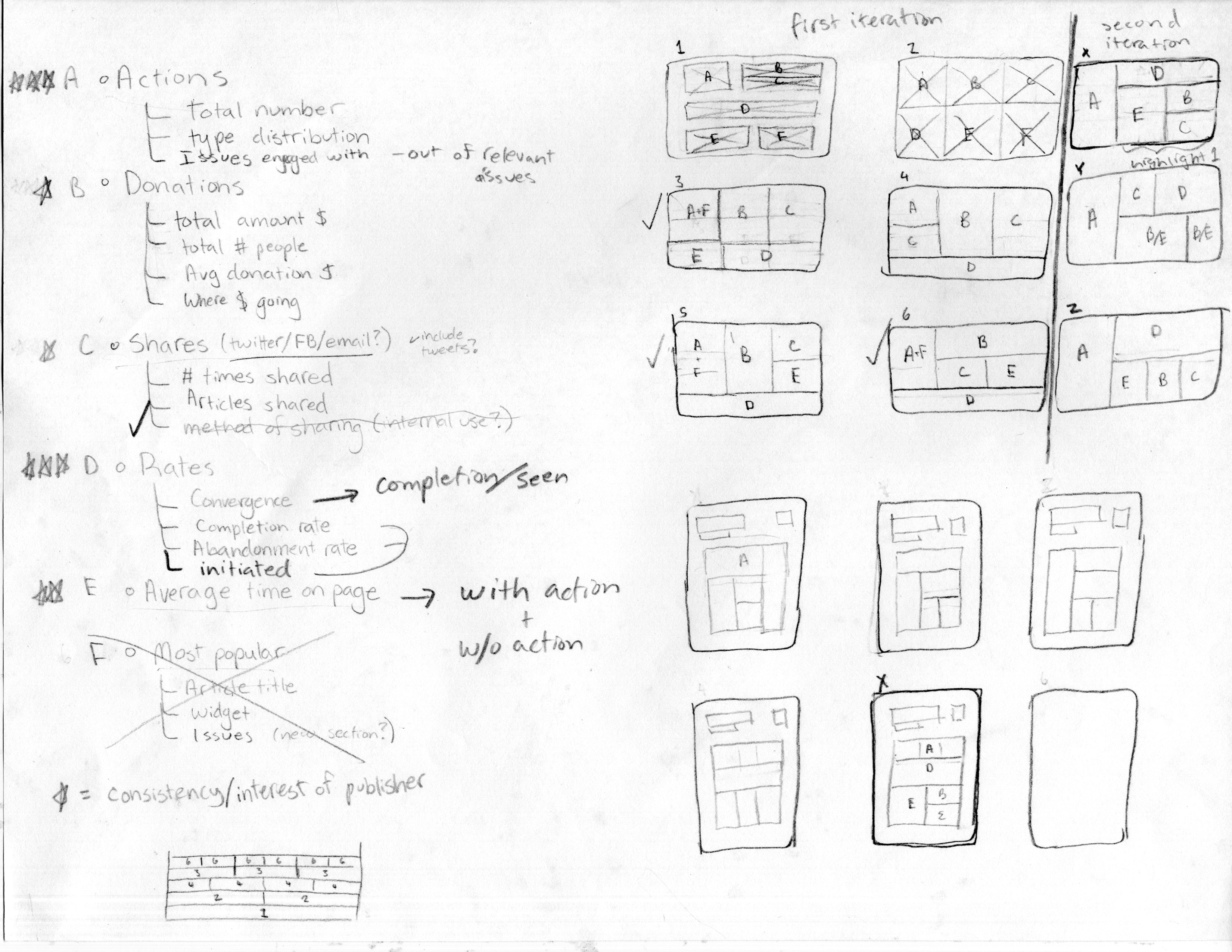
After talking to the team and watching their workflows, I gathered what I thought to be the most important user data to be included in a report. Here I began wireframing and exploring different layouts.
Reframe
I then took each piece of data and explored how I could lay it all out to best convey the information. In the beginning of the project, I did many sketches and diagrams to better understand what worked and what didn't. By reframing and re-representing the problem, I was able to wrap my head around data visualization, an area I had little prior experience with.
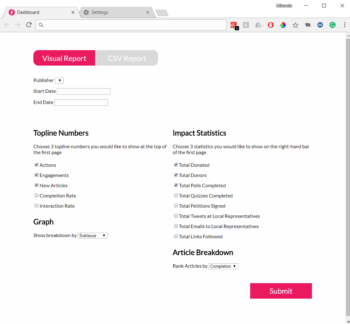
Wireframe Internal View
My first iteration of how the tool might appear internally included the basic options for a team member to customize the report, with a "preview" of the content included. Since the final report would be in print, the layout on the internal side differed from the client's view. While the final product contained most of this essential content, the visual hierarchy improved a great deal.
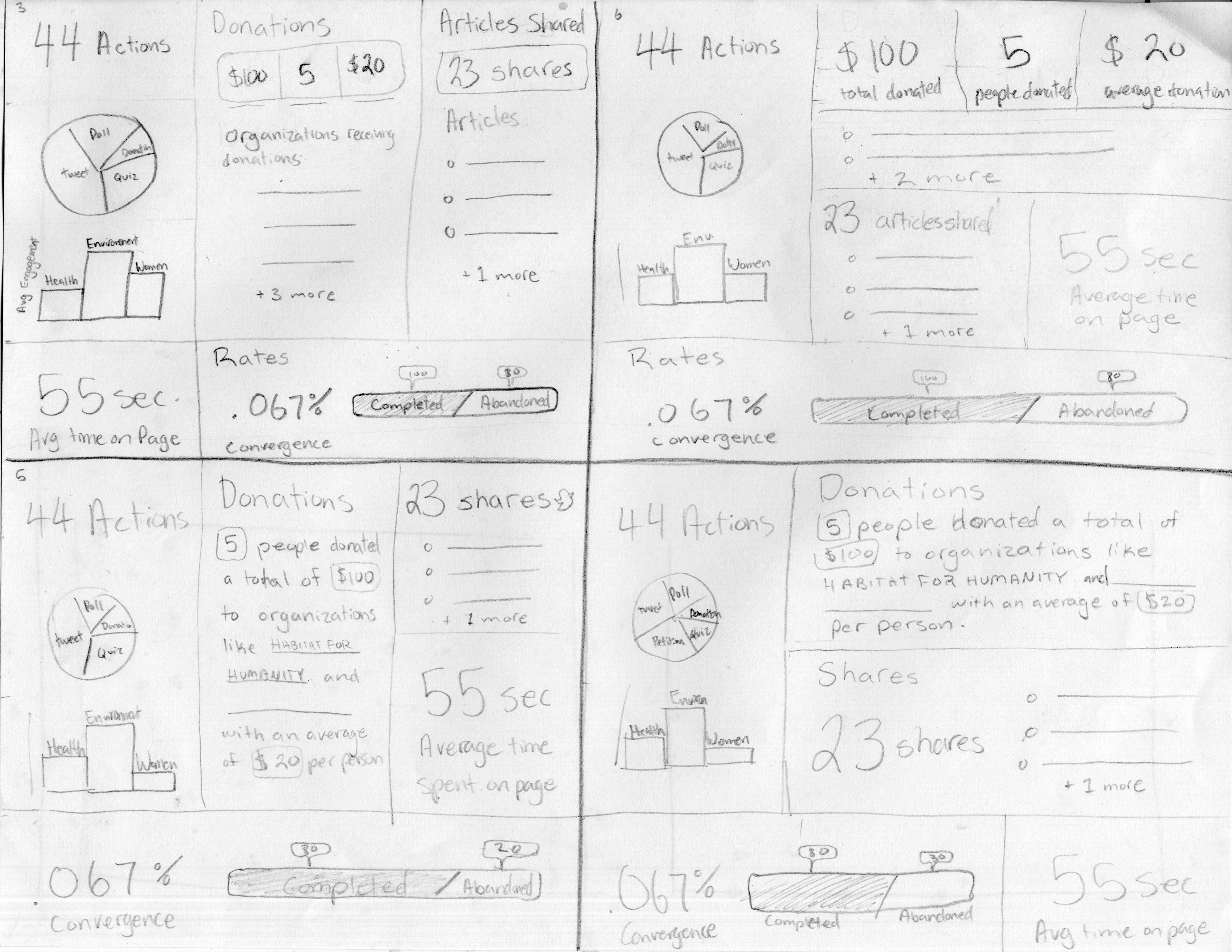
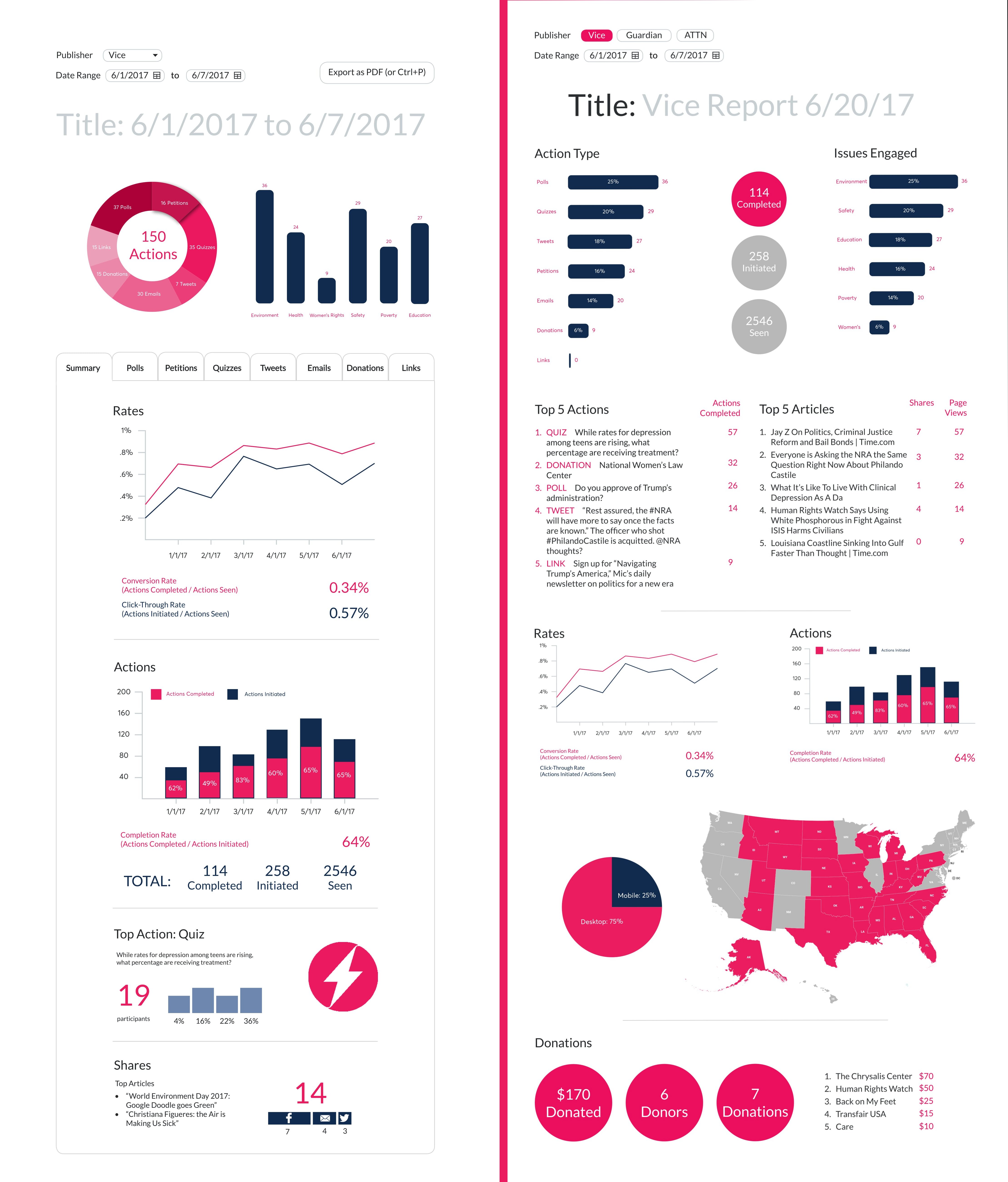
Wireframe Client View
This wireframe shows how the information selected by the team member would be displayed in final print form. The numbers here were made up, but once I was able to retrieve the actual figures, I realized some numbers were unobtainable or too low to include, which influenced which statistics I chose to include.
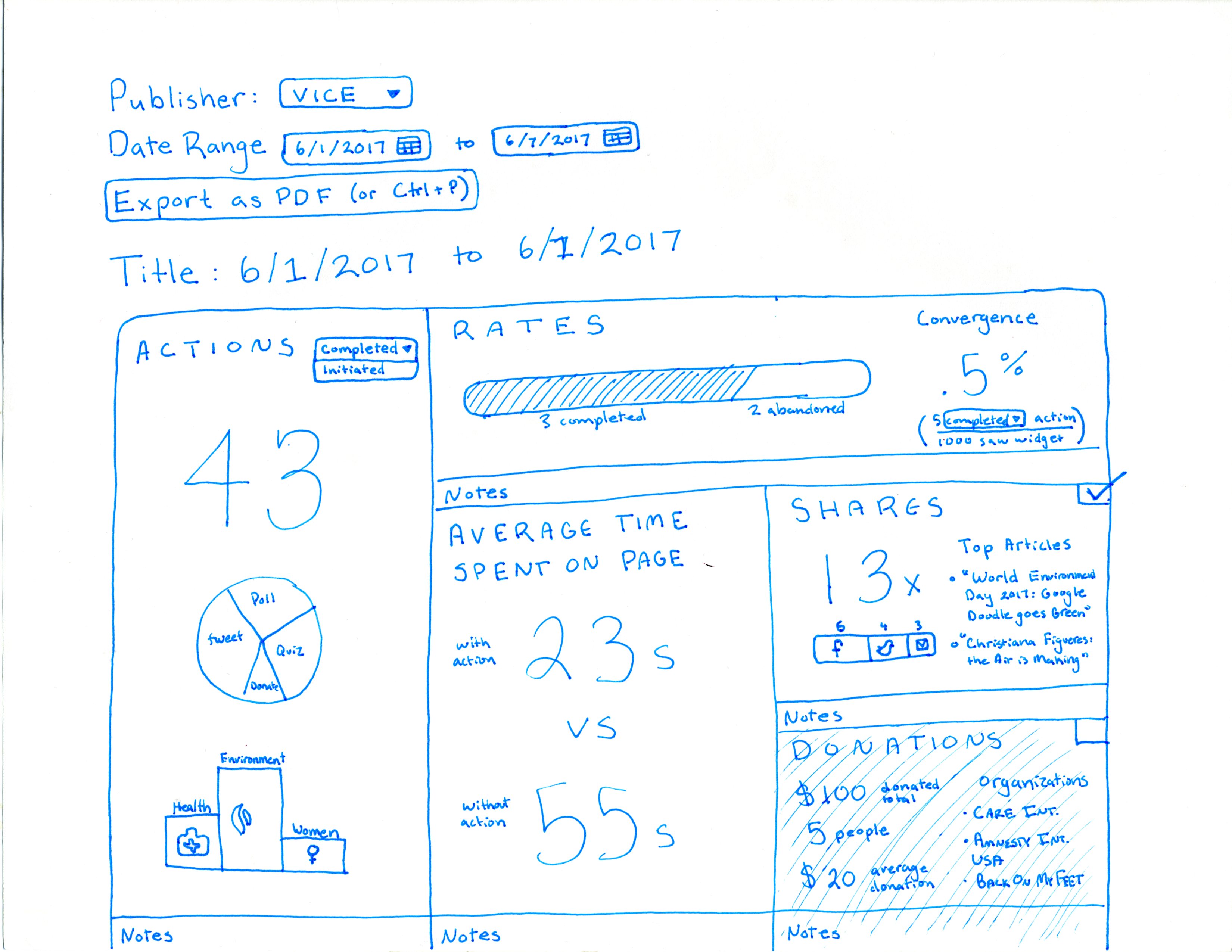
Mockups of Internal View
Both mockups here show how a user would view the information before exporting it to a PDF. The first focuses on the types of actions users take, but after receiving feedback from the team, I did a version focused on articles where the Action Button was placed. At this point, my PM convinced me that pie charts are the worst way to display information 90% of the time, and I stopped using them, much to my dismay.
Final Version: Internal View
The final product was a web app which produced a 3-page printable PDF according to a series of parameters for the data, selected by the user. Instead of focusing on making the data display nicely on the user side, I decided to simply give options to select the desired statistics and output a PDF report or a CSV report.
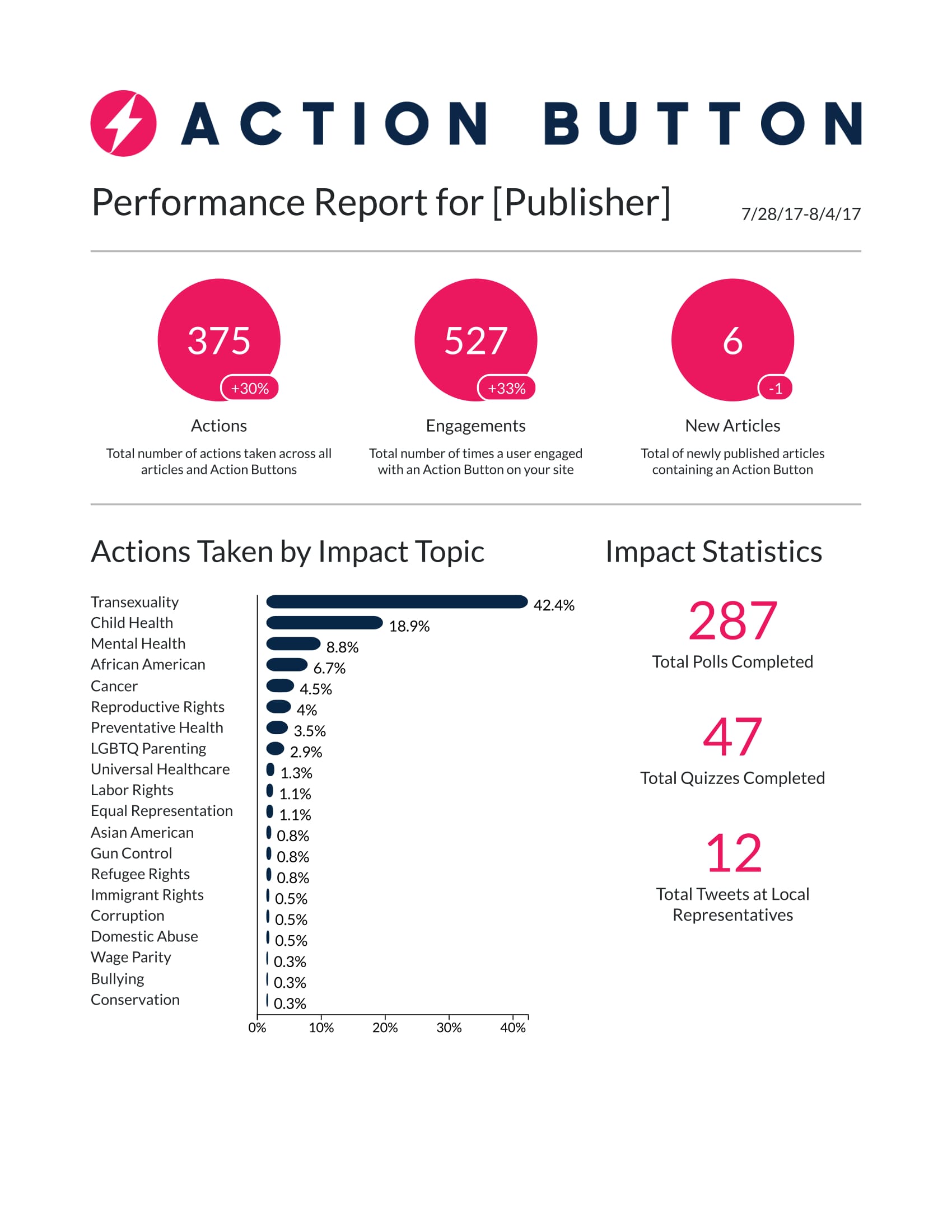
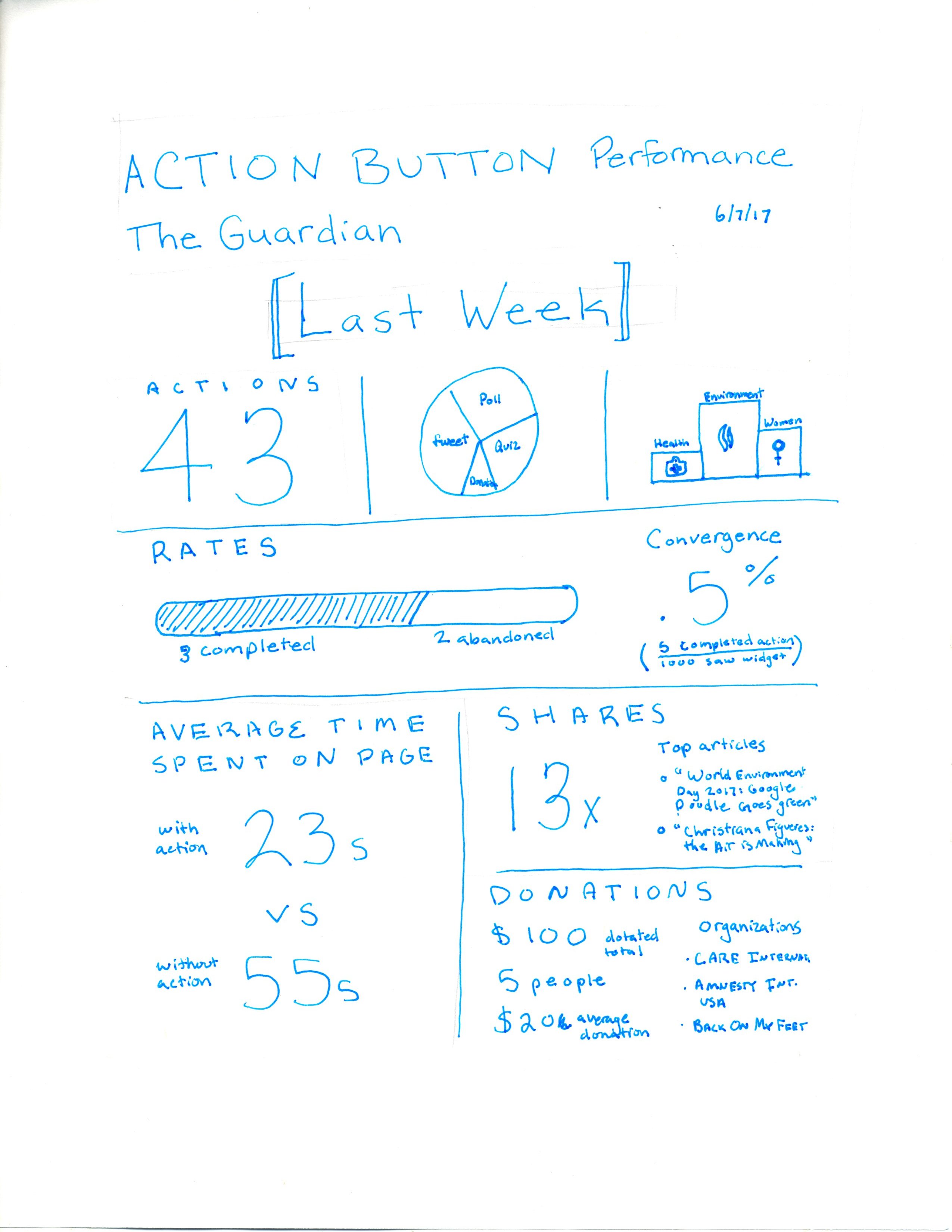
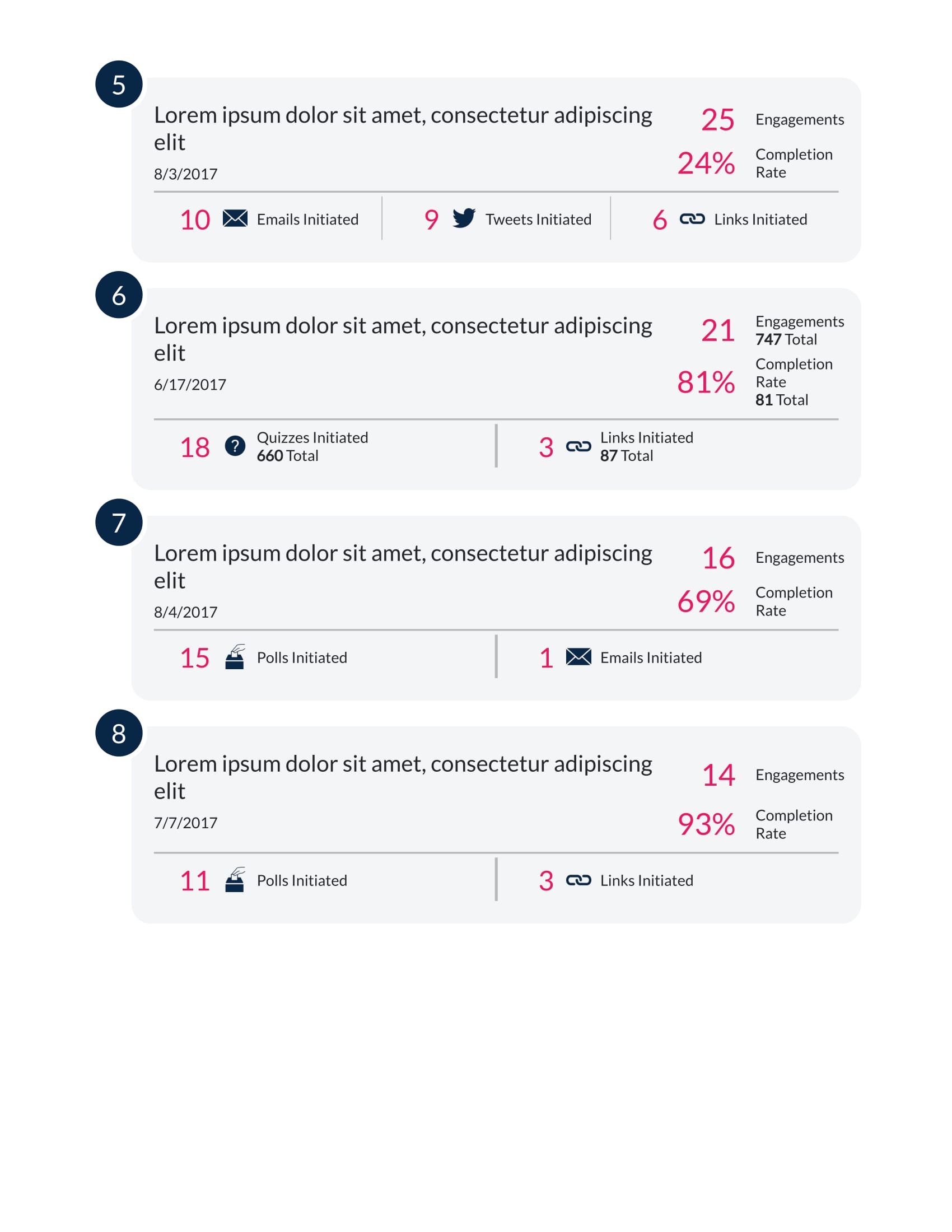
Final Version: Client View
To craft the final report, I designed it first in Illustrator, then replicated it using CSS and HTML. The first page is a summary report, showing topline numbers, a bar chart of the actions taken according to relevent issue, and a few secondary stats. The following pages outline the top performing articles for a given publisher, showing which actions were taken on that article. All iconography is also original.
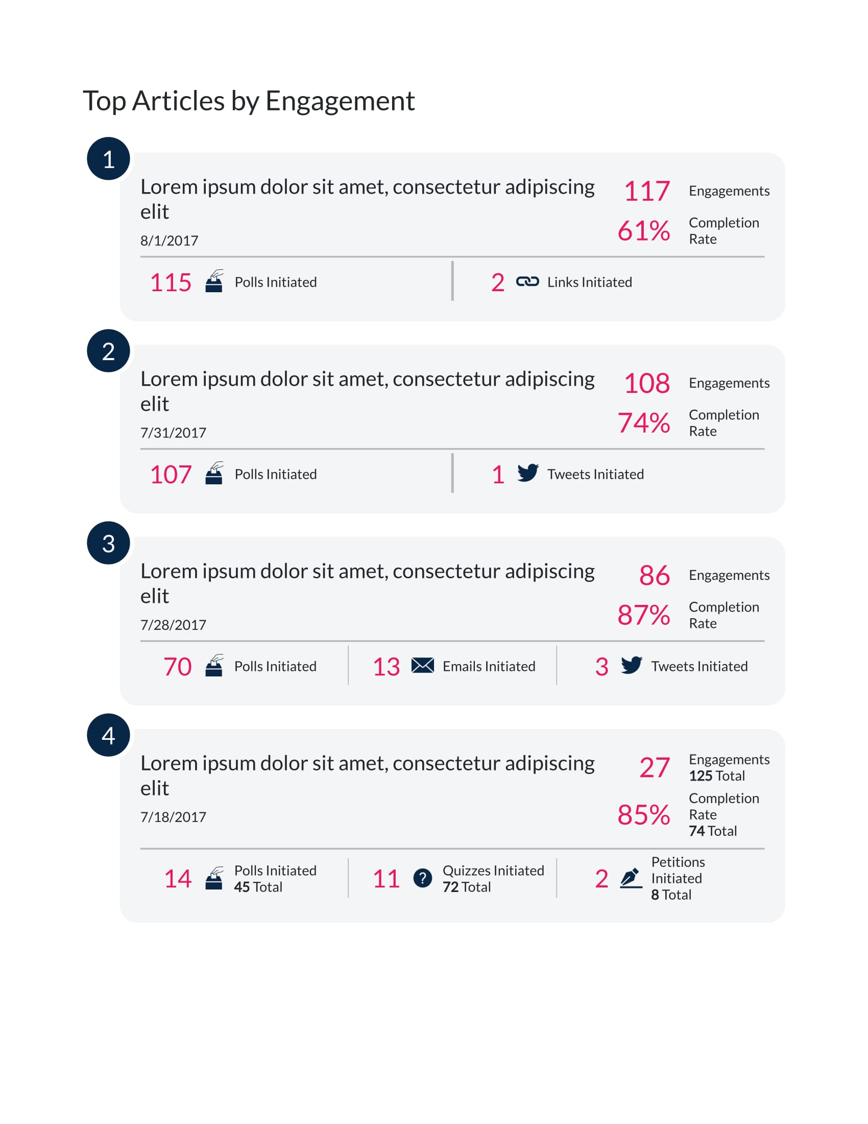
Final Version: Client View
To craft the final report, I designed it first in Illustrator, then replicated it using CSS and HTML. The first page is a summary report, showing topline numbers, a bar chart of the actions taken according to relavent issue, and a few secondary stats. The following pages outline the top performing articles for a given publisher, showing which actions were taken on that article. All iconography is also original.