Service Rehaul Fall 2018-Spring 2019
The Challenge
The Princeton Student Design Agency is a group of 30 or so student designers who take on contracted design projects for Princeton University clients. They have been around for about 10 years, though in recent years they had seen a sharp decline in revenue and staff experience. Many of the backend processes and front-facing interfaces had not been updated in years, demanding a full-scale refresh.
Improving the Backstage: Staff Experience
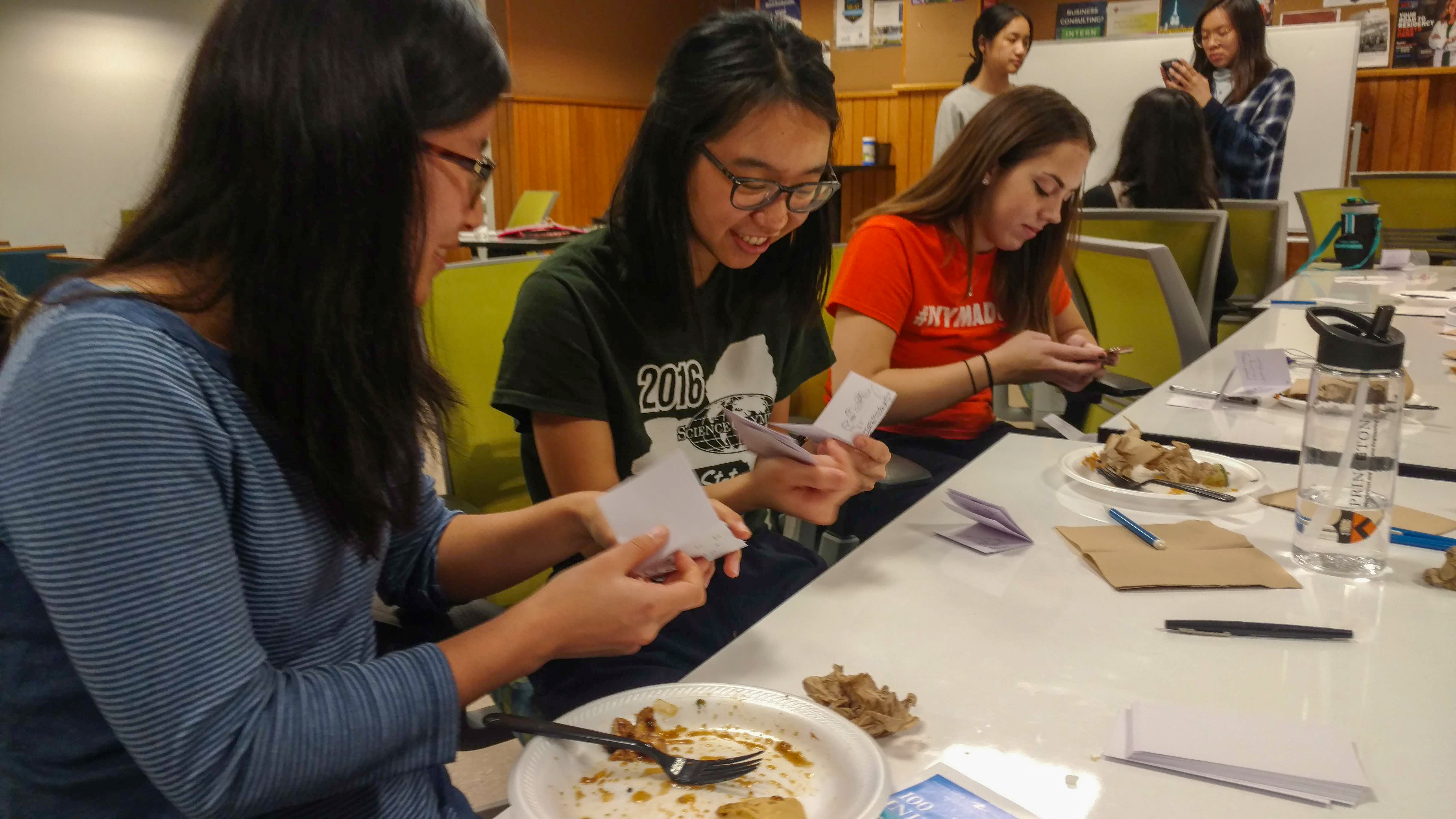
When I stepped on as Executive Director in 2018, there were many areas lacking in process and many of the student designers were disillusioned by their experience in the agency. My co-director and I had also had abysmal experiences design for the agency, so we understood the concerns and apathy among our fellow students. During my tenure, we spearheaded new community-building initiatives for our designers:
- Regular social events for designers to meet each other
- Design workshop series, led by agency members
- Gave free gear to members with new brand
- Paired each designer with "buddy" to support each other in design projects
- Switched communication channel from email to Slack to foster more open design critiques and conversation
- Featured student design work on social media channels

Improving the Backstage: Client Experience
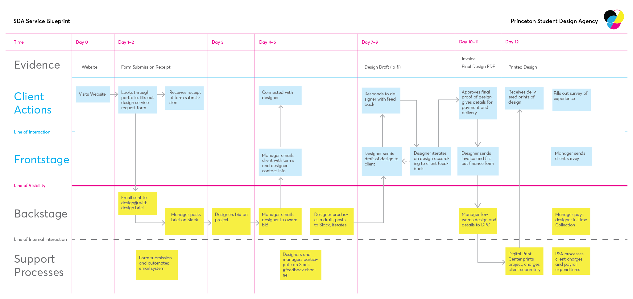
We forecasted that by improving the staff experience, we would also improve the client experience. However, we also strove to iterate on the client experience and ensure that our backstage processes were delivering a positive customer experience. To accomplish this, I used service blueprinting to articulate some of the breakdowns and pose solutions.

After mapping out the customer experience and our backstage processes, we highlighted some key issues. For example, after submitting a design brief, a client received an automatic receipt, but only was contacted individually after they were already paired with a designer 3 days later. We used this as an opportunity to communicate to the client earlier on what they should expect. We also noticed that designers were not very proactive about using our Slack channel for feedback. To encourage this practice, we established the expectation that for each project, a designer should submit at least their first draft to the larger group for feedback. Though our agency offered a relatively simple service, we found that there were many backstage steps that were opaque for both the directors and designers. I developed this blueprint in conjunction with my co-director to foster strategic conversations and to have an artifact for future use. As is the nature of a student-run business, we had high turnover in staff and leadership, yet very little process documentation. Blueprinting not only allowed us to find opportunities for innovation, but also develop a diagram that improved future onboarding processes for SDA staff.
Brand Refresh
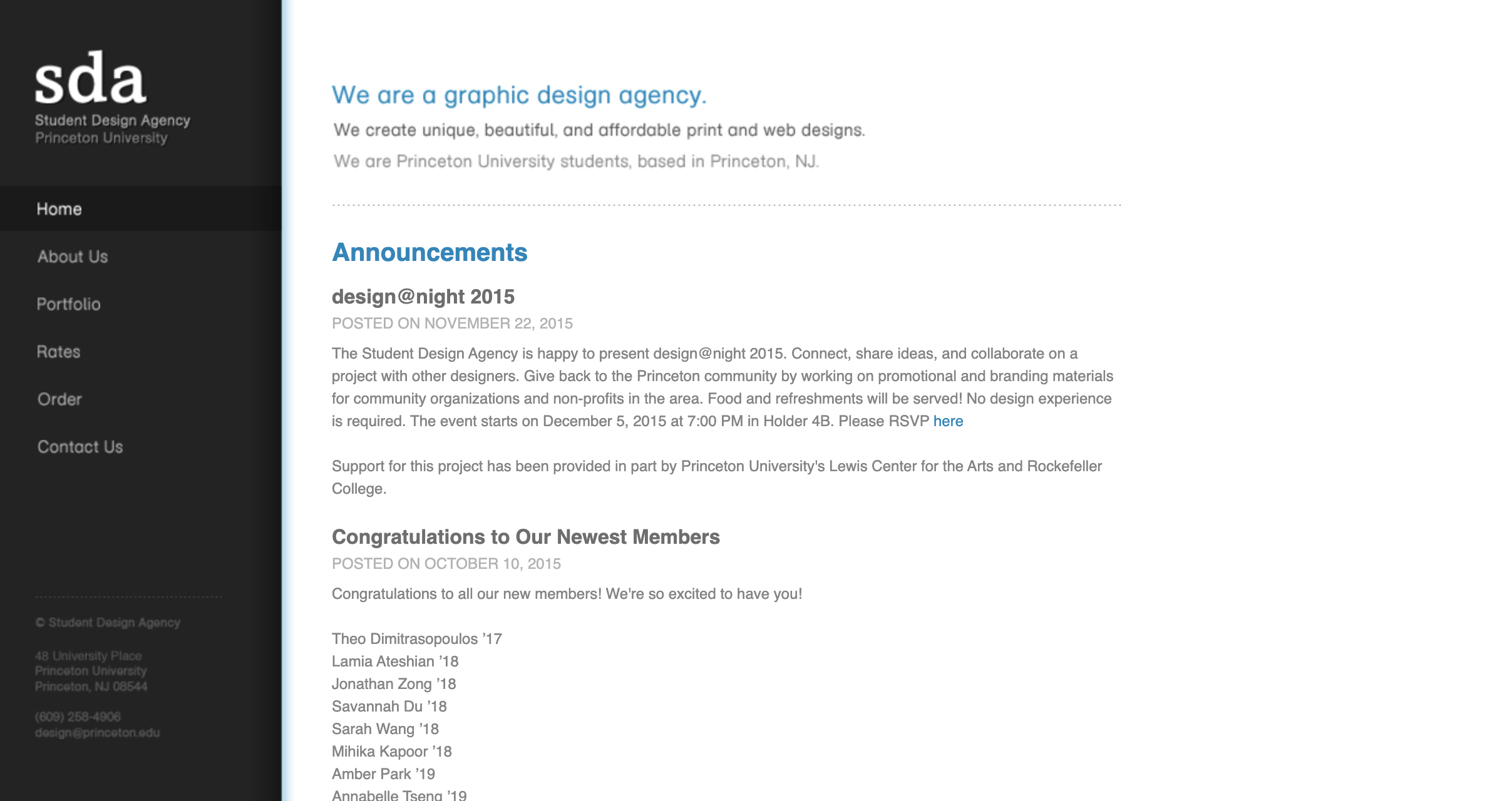
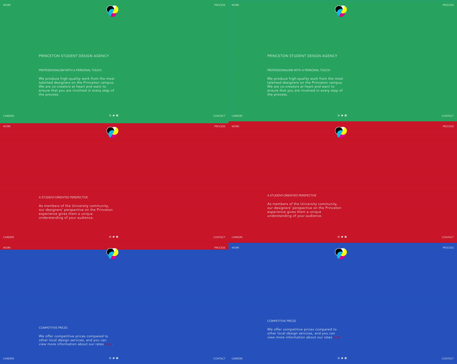
Traditionally, SDA had taken on a lot of print projects, and our scrappy custom-built website hadn't changed since the agency's inception. We knew that if we wanted to be taken seriously as a design agency and move into digital design, we needed to have a modern site with a brand that reflected the future of the agency. The old SDA logo was muted and revolved around typographic references. For our new look, we wanted something bold and dynamic. My co-director and I collaborated on the new logo design and solicited feedback from our community of SDA designers. The result was a CMYK color pallette with 3 overlapping circles, in which an "S" and a "D" were subtly incorporated to reference "Student Design". We had one of our designers create a new website with similarly bold color blocks.
Before


After


